Rex - Making a special file explorer
We all get ideas for projects that we can’t get out of our minds, specially if you’re an engineer or tinkerer. There’s just this itch on the back of our minds telling you to start working on a new idea, with the premise of huge satisfaction to come. This becomes a huge problem when dealing with another, already-started project: You begin to lose interest on it and get attached to the new idea. What if it’s a success? What if it turns out to be incredibly simple to achieve? What if–
Well, after a few months trying to stop that exact urge, I got into the new project bandwagon for the hundredth time in my life. This time, it was a file explorer. With a twist.
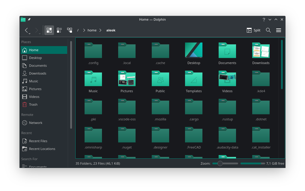 image: The Dolphin file explorer running on my laptop
How It Came To Be
I watched this video by danooct1, which showcases a relatively ancient game called VIRUS: The Game. In it, the user drives an attack ship and must destroy virus enemies that appear in their own hard drive, navigating through rooms generated from the structure of their filesystem. While the game itself has really harsh reviews, I think this way of interpreting virtual space is really original and, with the rise of VR and events such as the Meta reveal, I really can’t believe it hasn’t been expanded upon and presented to the mainstream audience.
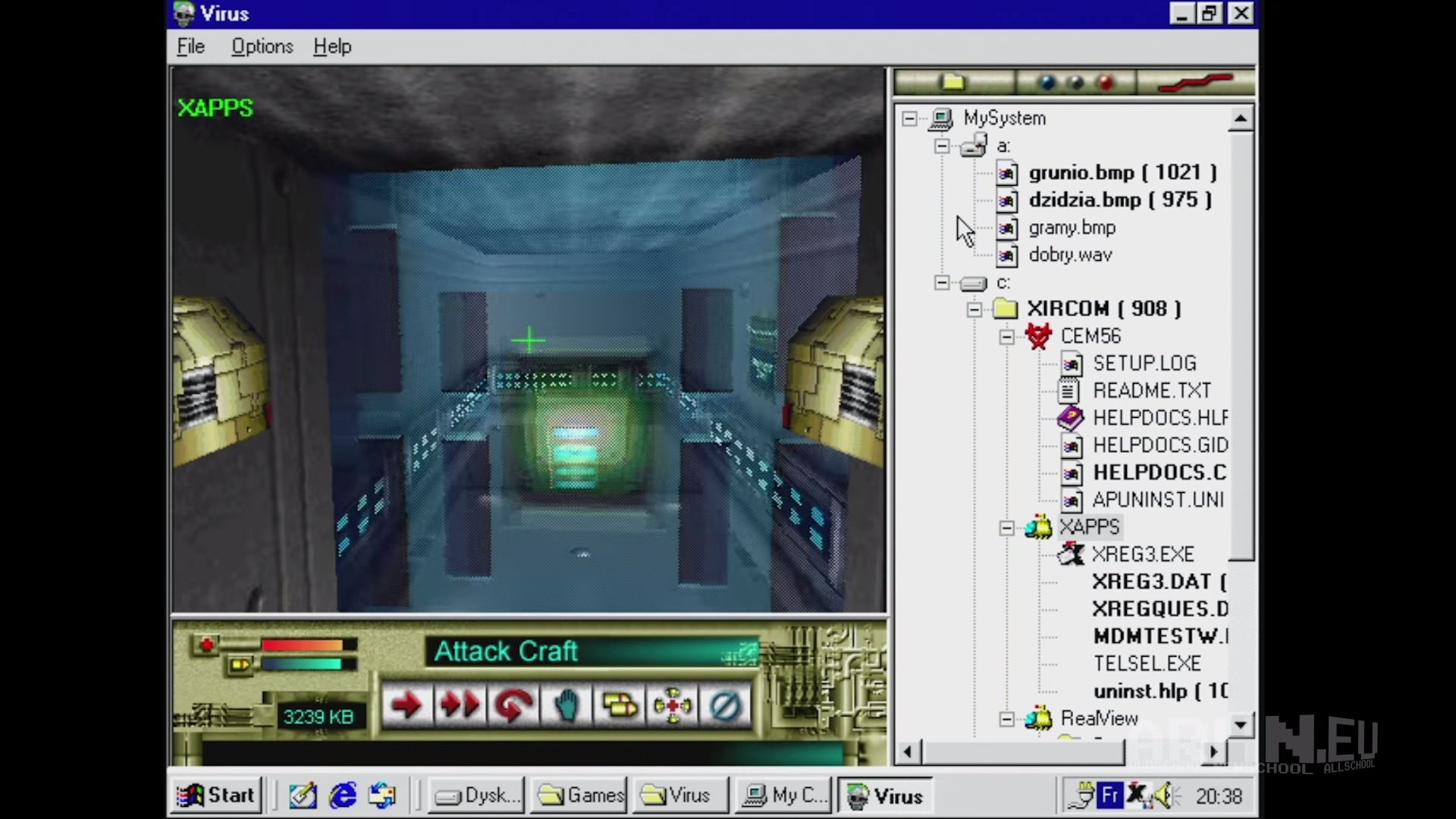 image: Virus: The Game (source)
I started to think about how it could be applied into a modern experience, but soon realized that finding a good matching gameplay loop was really hard to implement in an environment like this. The actually interesting and original bit from the game is the way it generates a procedural world from the user’s own data; that’s about it. As such, any way to make the experience more interactive or fun is outside the scope for the project. I didn’t know if the end result was going to be worth it, basically.
Even then, I went on with it. I named it Rex, short for “Room Explorer”, and decided to make it a visualizer which maps directories from the user’s filesystem to 3D space as virtual rooms, and then decorates them with files from the directories themselves. If that doesn’t seem like a fun game, that’s by design; I just want impressive screenshots of seemingly infinite buildings, creepy corridors full of things I didn’t even know I had in my system and environments I can spend days exploring. Not really interactive, but not neccesarily boring either; I don’t something I can play, but something I can experience.
The Plan
After having made a new cargo project and I had added WGPU as a dependency, Mark from GTMK thankfully saved me from doing what I always do, that is, treating the project as if I knew exactly what I was going to do and that the final idea was going to work. Believe it or not, I never make prototypes; I’m not against them, it’s just that I somehow believe that my projects are simple enough to go knee deep into without getting lost. This is always false. Thanks to this video (which I really suggest watching) I decided to first make a small prototype of every feature in Godot, which would also allow me to test any algorithms without having to think about their repercussions in the final internal API. This was a really good idea which I recommend you also do with new projects if you don’t already.
Having decided my toolset, I set some goals:
- Creating rooms (Explorable geometry) in 3D space, and assigning each directory in a filesystem one
- Connecting rooms via doorways or likewise if they are parent and child, ignoring shortcuts for now
- Adding one “prop” per file in each directory in their according room, which must be related to the file in some way (e.g. small text file can be a note, image file can be a painting hung up)
- Decorating rooms according to what their directory represents (e.g. image folder -> gallery/museum, media folder -> cinema)
- Ensuring rooms don’t shrink or move at any point, but delete them if their directory is deleted, or expand them if required to fit entrances to its subdirectories
And I made a tasklist so I didn’t get sidetracked:
- Figure out how to and which space to allocate for each directory room
- Add geometry to this allocated space such as ladders and stairs so that every part of the room is accessible
- Add props related to the files in the directory
- Decorate walls, floors, etc depending on what the directory represents
In this blogpost, I’ll explain the first step, which is where I’m currently on.
Allocating Room Space
The first problem I decided to solve was how 3D space was going to be distributed among different rooms. This was a challenge to solve, and I went through a couple of iterations before landing on my current approach. In all of them, I divide the space in cubic cells using a 3D grid and assign those to specific rooms, which simplifies the process by a lot.
However, it isn’t as simple as just giving random cells to every directory room in a filesystem, since we want parent directories to be connected to their children, and cells belonging to the same room to be together. There’s also the problem of creating more subdirectories when we exit the application, since we want the room structure to stay consistent and never shrink or move.
The difficulty of this process relies on that last point. If rooms are stationary, they should thrive to always have space available to expand if required. Otherwise, there could be expansion issues:
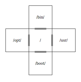
In this case, the root directory / wouldn’t be able to expand to accomodate more children because all of its possible exits are blocked by its own children. To mitigate this issue, we could insert a constant that indicates how many empty neighbours to have when expanding and adding room children. For example, if we set it to 3 in the previous example:
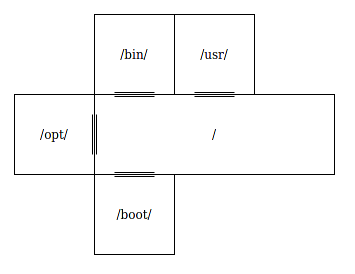
The root directory is now free to add more children and expand however much it wants. However, this approach is not flawless, since there are instances where rooms can’t expand because their own parent has closed all of their neighbours:
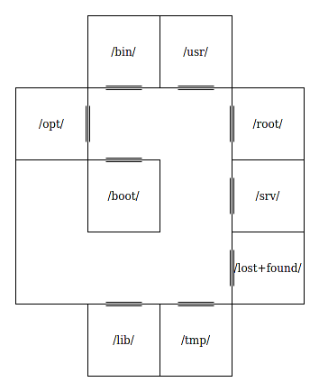
I found that, to solve this, rooms could be allocated an infinite amount of cells that doesn’t overlap with other ones the moment they’re created and then assign those allocated cells when neccesary. However, this approach heavily limits the shape of all rooms and finding infinite “infinite cell sets” is not trivial due to several reasons, so I decided to go with the simpler non-mathematical option of just not really caring at all and stopping generation for a room if it isn’t able to be expanded. This can later be fixed with portals that teleport you between two places. (The reason I didn’t go with portals for all connections in the first place is because they mess with spatial awareness and don’t play nicely with maps)
After explaining every trick up my sleeve, here’s my first iteration:
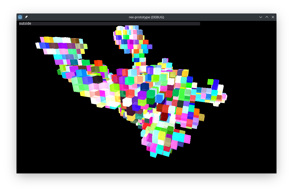 Underwhelming, ey? This is my documents folder on the first iteration of the algorithm, assigning random colors to each room.
This is a few days later, after I had implemented doorways. There are some lighting and doorway glitches (The last room shown, for example, apparently has two doorways to its parent, which should not happen)
Next up: Adding geometry to these empty cells, so that a player without flying abilities can explore them. This is where I made a mistake and decided to do that after I had created the room bounds geometry. And although I tried to save it by adding ladders, I eventually had to give up and call this approach wrong.
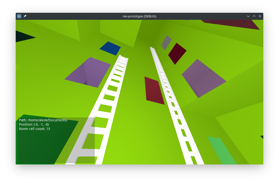
The problem here is that I wasn’t considering the limitations of the player when generating the rooms. It’s as if you gave an architect a random set of cubes and told them “Here you go, make this an actual building!” And of course they wouldn’t be able to–
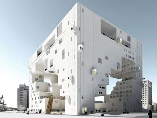 oh.
oh.
My point is that having the layout and the internals of the building as separate processes makes building the interior much harder, specially programmatically. With this in mind, I started working on the second iteration of the algorithm, with focus on explorability.
Making It Explorable
In the second iteration, I borrowed a few ideas from the deceptively named wave collapse algorithm. It allows filling space depending on some set rules, which can be extracted from a sample.
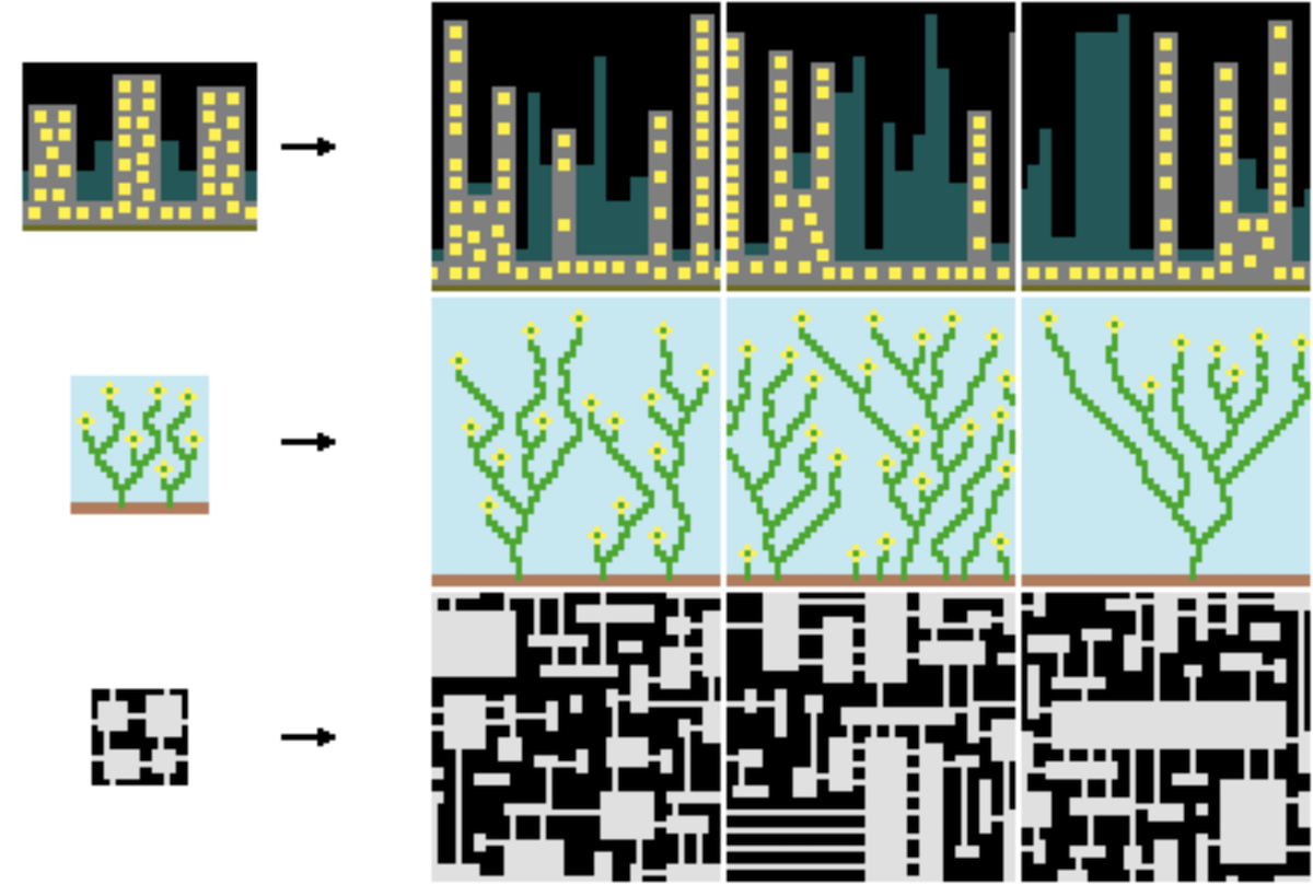 Image showing algorithm results (source)
It also works with higher dimensions (source):

Its inner workings may seem extremely complicated, but in reality it’s like putting together a puzzle in real life: You start from a piece, start putting pieces that fit together next to it, and eventually get your finished puzzle. In the wave collapse algorithm, pieces have rules that mandate where the piece shouldn’t or should go: “There can be a connecting piece of this type here, another one here”, and so on.
Wave collapse is extremely versatile and can be used from sudoku solving all the way to map generation. As such, I decided to make my own version for Rex, accounting for room structure and whatnot. I set each piece to be a room architectural element, such as a corridor, stairs, …and well that’s it because setting up the pieces was tiring. Something to keep in mind is that, in my implementation, pieces are not neccesarily constrained to being one cell in size, which is really just a shortcut for avoiding splitting stairs models into multiple scenes.
I won’t talk about the actual implementation because it’s not optimized and would be boring, but if you want details about it feel free send me a DM in Discord.
I also changed the crappy handmade models to ones made by the amazing Kenney (which I’ll need to tweak at some point so they don’t have gaps and produce z-fighting issues)
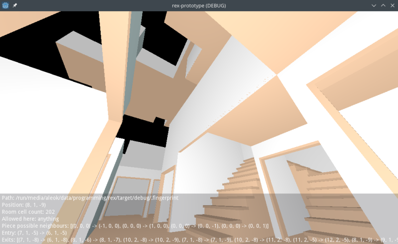
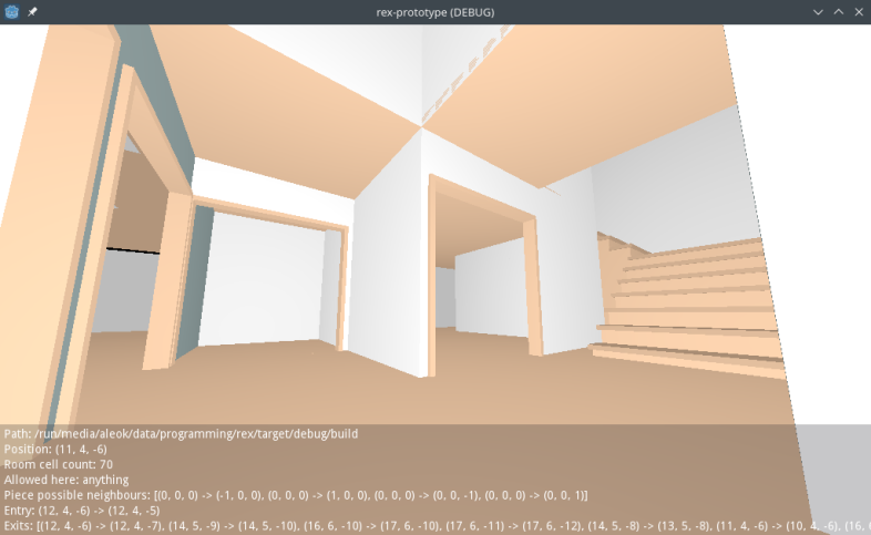
Finally, we have something that looks more like an actual (liminal) building rather than a colorful kids ballpit. But sadly, that’s about it for now. Tune in next time for possible performance improvements and watching me poorly explain how I added file props.